Design Systems: A Practical Guide
Hand-written · No AI
Like all other design in the world, a design system solves an everyday problem. And what is the definition of the problem in this case? Inconsistent communication. We run into it every single day, whenever we try to communicate our brands, our products, concert invitations, or letters to our grandmother through visuals. And yes, even in such a simple example, a lot can go wrong. If, instead of “Hi Grandma” at the beginning of a letter, we write “Dear Grandmother,” and the letter is not handwritten but printed, Grandma may not know whether it is really you writing to her or some lost prince asking for money. If our communication is not consistent and well thought out, it may cost us the success we were aiming for. And how does consistent communication come into being? By creating rules and sticking to them every time. And that is our design system.
A design system is a set of rules that guarantees consistent visual communication.
It is not just a set of buttons and their states, although even such a simple example could serve as a starting point. But let us stay in theory for a little while longer. What is the difference between a design system and a brand manual? I could say, rather egoistically, that a brand manual is a small part of a design system, and more or less that is true. A brand manual also defines brand consistency in its own way. Logo, colors, typography — and in the end, it can be so extensive that it starts to resemble a design system. In the past, and to a large extent still today, a brand manual primarily defined the use of the logo for external communication — in other words, situations where someone else wanted to communicate your brand. You, as a designer, developer, or marketer inside the company, already knew how to communicate the brand. You knew what logo you had, what colors, what fonts you used. But that is where most brand manuals end. A design system goes further. It defines which combinations of headings and paragraphs you should use in specific situations. It tells you their colors and spacing. It should tell you that this type of heading is used as header-5—multiline and that it appears in these eight use cases. A brand manual will not tell you that. And by saying that I do not mean in any way to diminish the value of a brand manual. Just like communication strategy or a media plan, it is an essential part of consistent brand communication and it has its place.
The Building Blocks
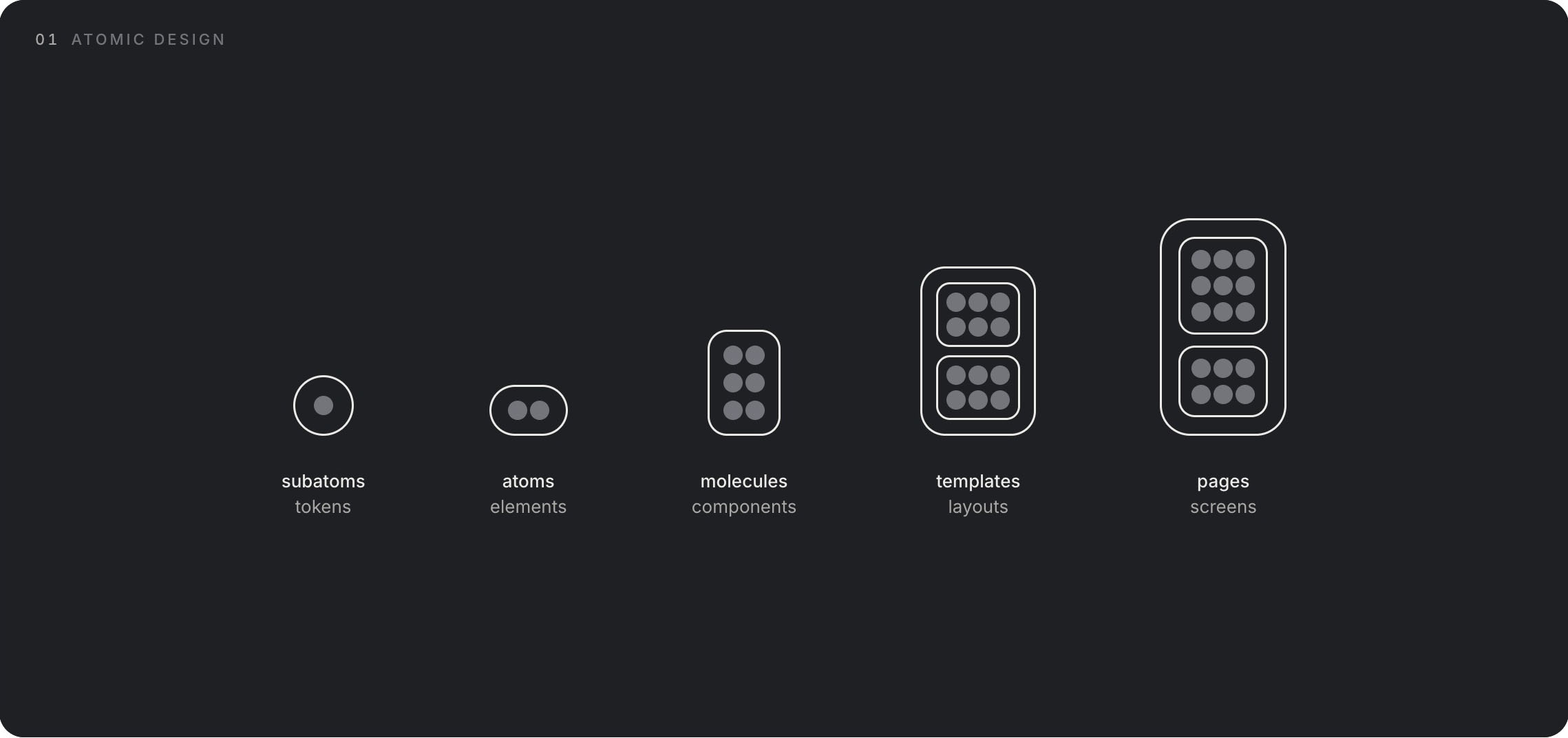
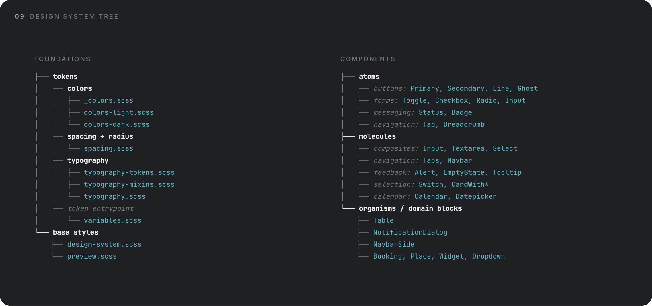
A design system consists of several basic parts, which you can think of as atoms that combine into molecules. It used to be called atomic design. But it became such a foundation that there is hardly any other way to talk about it now. Yet atoms themselves are made up of neutrons, protons, and electrons, and in a design system those are called tokens. A token is a set of variables, such as color. But that color may behave a little differently in light mode and in dark mode. It may behave differently in its resting state and in its hover state. Sure, at that point it is technically a different color, but we will get to that. In practice, the structure looks like this: we have color, font size, border radius, spacing, and so on — these are tokens. They form a button — an atom. And a set of buttons, for example in a menu, becomes a molecule. If we go further, a set of molecules forms a template, a set of templates forms a page, and so on. But that is not where a design system ends.
As I mentioned a moment ago, these tokens can have different variations, different modes. A single color can behave in different ways. One reason is accessibility. In practice, I know that colors appear slightly different on white backgrounds and dark backgrounds, so I want them to be subtly different. To the eye, they will then feel the same. It becomes even easier to explain with typography sizes. The previously mentioned header-5—multiline might be 24px on desktop. But on a phone, 24px is far too much, and I want those 24px to appear as 20px instead. So I create a phone mode for the token that defines this value. Then I may want to define interaction. I want all buttons — all interactive elements, not just buttons, meaning links, cards, and so on — to react to hover or touch-and-hold, and I want them to become 10% lighter. I could define a separate color for each element in each state, and that is one option. Or I can simply say: I want them to be 10% lighter. I have created a rule, a system. My job is to maintain that system. That way, I, the developer, and the users of our products all know that if something becomes 10% lighter when I hover over it, it is interactive.
Tokens
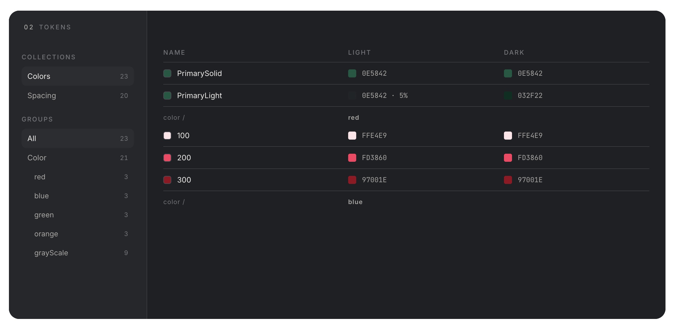
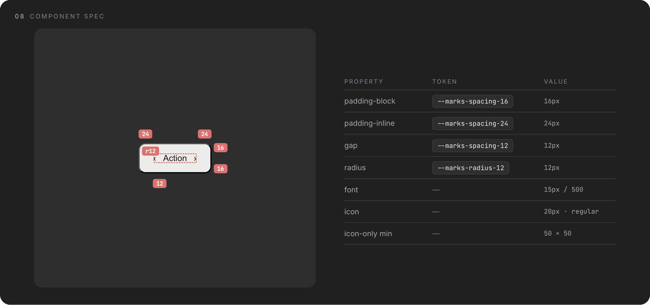
Tokens are the fundamental variables we use to build larger elements — atoms. A token can take many forms and there will always be a thousand ways to define and use them. In practice, I have found it works best to name tokens as close to their value as possible, while keeping them abstract enough not to define the variable directly (with some exceptions). For example, primary-red or red-100 is a good name for any changeable red, while clearly indicating it is the primary one or 100%. Another example is spacing. There, on the other hand, it pays to use the exact value, unless I am creating a very simple design system. I could use spacing-m or spacing-xl, but in actual use I do not know what that is. On top of that, if I have spacing-s and spacing-m, it becomes very difficult to add an in-between value — would that be spacing-sm? In practice, I have found the four-based system works best for spacing: spacing-4, spacing-8, defining values of 4px and 8px, and so on. The design system then defines when and how to use these spacing values.
Each token can therefore have different modes, based on divisions for display devices or light and dark mode. This covers all the situations that occur in the real world.
Semantic tokens are the next level of abstraction. While primitive tokens define raw values (red-500, spacing-8), semantic tokens define purpose and context. Instead of using red-500 directly in your button, you use color-error or color-destructive. Instead of spacing-8, you use spacing-component-padding. The advantage? When you decide that error messages should actually be orange instead of red, you change one semantic token definition and every error state updates automatically. Semantic tokens translate “what it is” into “what it means.” They form a bridge between your raw palette and real-world application, making your system both more maintainable and more meaningful to developers who consume it.
Colors
Colors are tokens, but they deserve their own discussion. Colors have several levels. Brand colors, which include primary, secondary, or accent colors. Then there are shades of gray, which can be as broad as we make them, and finally colors that communicate states, emotions, or changes: errors, warnings, successes.
Typography
Typography is not a token itself — it is a set of tokens combined into typographic rules. But it is a bit more complicated because it is defined by its own tokens. We have a font (token) which can be different for headings and paragraphs. It has different sizes (token) for headings and paragraphs, and that is not all. Buttons, links, and so on can have different weights (token) and styles. What is often forgotten, though, is the definition of line height, or line-height (also a token), and then the most overlooked thing of all: the space between heading and paragraph, between paragraphs. This can be defined within the typography itself or within the molecule. In my experience, it is best to define it as high up as possible, meaning in the typographic rules themselves.
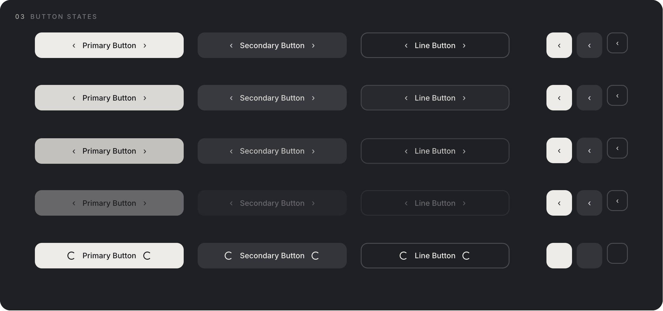
Buttons
Now we are finally at those buttons. The fundamental way to communicate an expected action. As a designer, you are suggesting an action you want the user to take. As a user, you expect that a button will take you somewhere. A button is defined by tokens — color, spacing, typography, radius — and by different modes and states. It is essentially a table of rules. But buttons are important because they sell. Communication itself is the tool that ultimately makes you click that button and pay. Buttons therefore deserve extra attention.
Elements and Components
We have atoms, now let us move on to components. Or molecules, depending on what you want to call them. A component is made up of atoms or other components. And it primarily serves the purpose of reusability for consistent communication. This is extremely important. This is why we are talking about systems at all. Communication must be consistent. Components should support that narrative. Repeating components with the same purpose create confidence in users, and that confidence leads to conversion.
Components can be identical. They can also be variable. Their content can become more complex or simpler, but their purpose and effectiveness should be preserved. Let me explain with an example. We have a component — a card with a gallery, text, and a button. It can serve as a product card. I can use that same component elsewhere, but this time without the gallery, and the user still knows it is a product card. They trust it, they know exactly what it does, because they have seen it before. That is what we call a pattern.
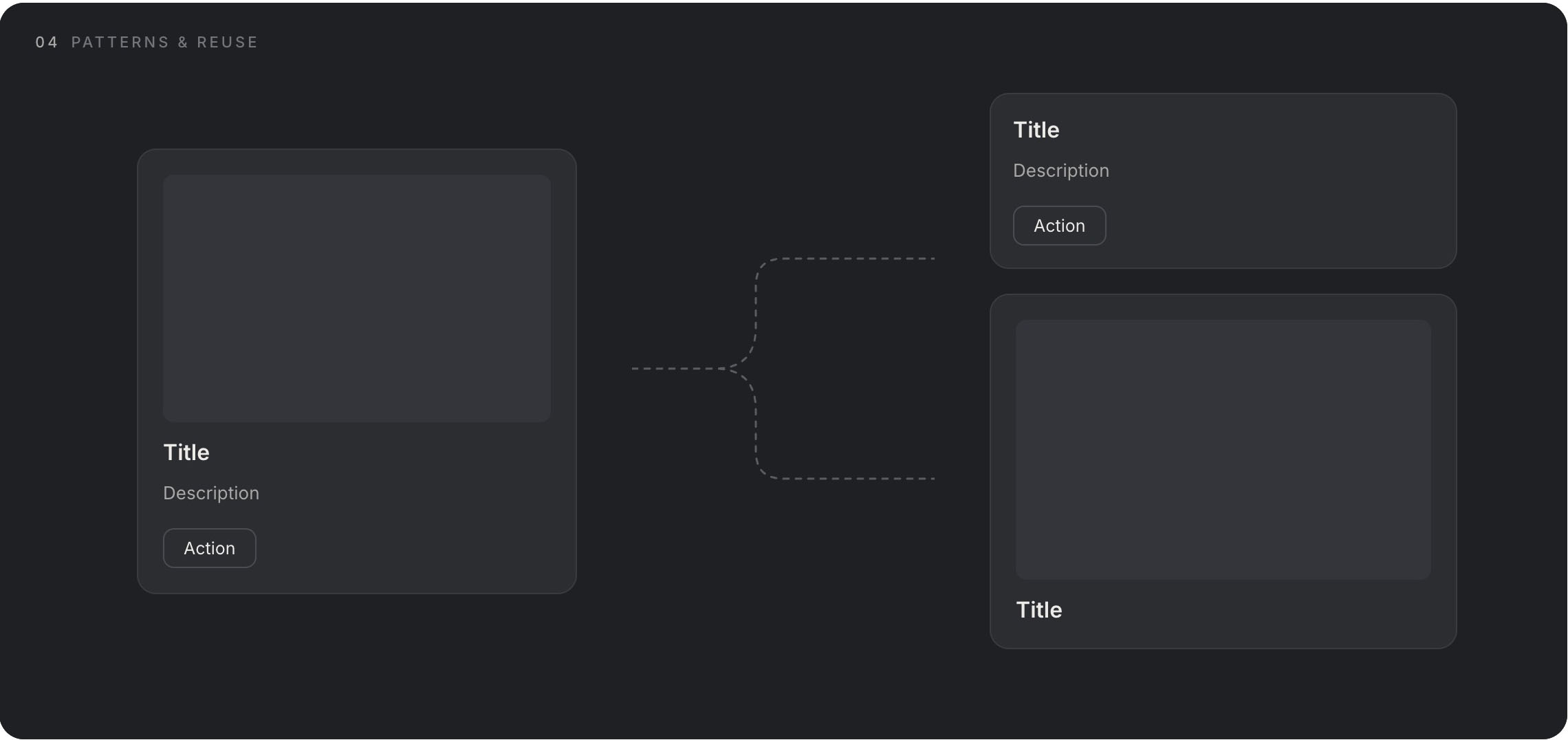
Using these patterns, we guide users to where we need them to go.
When do I need a component and when do I design a single-use element? We have actually answered that ourselves. If I know I will use the element elsewhere to communicate a pattern, I create a component. This is where AI still fails, even though it should excel. Too often, when communicating patterns, it creates one-off elements, blocks that do not follow any rules. Through these small steps it undermines user trust and betrays itself and the low-quality system.
Modes
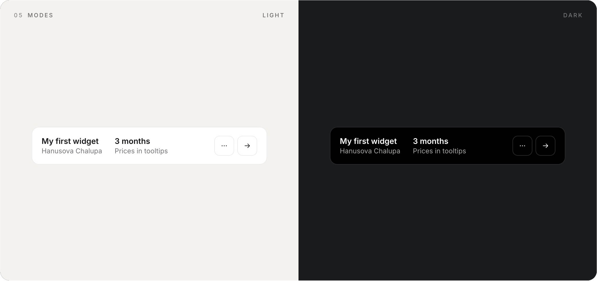
All right, we have tokens, we have atoms, and we have assembled a component. One thing that is often forgotten is modes. A relatively new concept, closely tied mainly to Figma, but I believe it is useful primarily in the real world and in development. We all know light and dark mode. We often invert shades of gray so they work well on dark backgrounds. But it does not end there.
We also use modes to separate specific devices. When we want semantic tokens (header-h2, spacing-12) to behave differently in practice. I want header-h2 to be 54px on desktop and all clickable devices, because their use, distance from the face, and dimensions are more or less similar. But for a phone, I want this heading to have a different size. For a kiosk at McDonald’s, as well. We design for real devices, not for simulators. That is where a huge difference arises. Sure, I can solve it with some kind of conversion scale ratio. That is, I say that on a phone all dimensions will be 30% smaller. On a kiosk, 15% larger. But that runs into harsh reality. Mode definitions give us much greater possibilities for consistent design. Let us say we want the heading 30% smaller, the paragraph 10% smaller, and the spacing 50% smaller. Then we are in trouble. And that is reality.
Copywriting
Is the style of communication part of a design system? Absolutely! We have created a beautiful handcrafted letter to Grandma, and a change in tone will tear down our entire system like a house of cards. And what is more, I believe that appropriate and above all consistent copywriting makes up a large part of successful communication. There is a huge difference when you write “Continue,” “Forward,” or just put an arrow pointing right in a button. I guarantee you conversion differences in the tens of percent.
The Dark Corners of Design Systems
We have talked a lot about what a design system is and what makes it up — probably everything by now. But there are a few things that are not talked about as much and yet they play one of the main roles.
Maintenance and Documentation
We have beautiful buttons, everything works. But we need someone to use our design system. And even better, we need them to use it the way I intended. Quality documentation is the enemy of agile design (I do not enjoy it either, I will not lie to you), but quality and above all usable documentation creates a very lively environment for your design system to actually be used. It is therefore necessary to establish a process that you will maintain when creating a design system. Both when creating new components and when editing existing ones. If you make a change in a design system and no one finds out about it, it does not exist. In practice, it is essential to keep components healthy (without errors) and versioned.
Real-World Use in Development
This brings us smoothly to how to prepare a design system for development. We can talk about different tools, and each can serve someone differently. This is how it works for me and the developers I work with.
Let us say that as a designer you know absolutely nothing about development. Close your computer and grab a shovel. No, I am joking — but still, just as a surgeon needs to know about the functions of the heart, a designer should know about how their design actually works. Ask developers what they need to know in order to use your design system. That is where you can start. Do not create things that do not work — ask questions. If I knew nothing about development, I would try to describe my design system in as much detail as possible directly in Figma. Interactions, real examples, outside references.
And if I had a development background, let us go into greater depth. What is my goal? To explain and convey my vision to developers. I want to show them as precisely as possible how my design system should look and function. And that is best done in their environment. Interactively, with code. What is the developer’s output? Functional components. My output could be the same. As a designer, I do not have to deal with details, my code does not have to be good. My code has to serve a purpose.
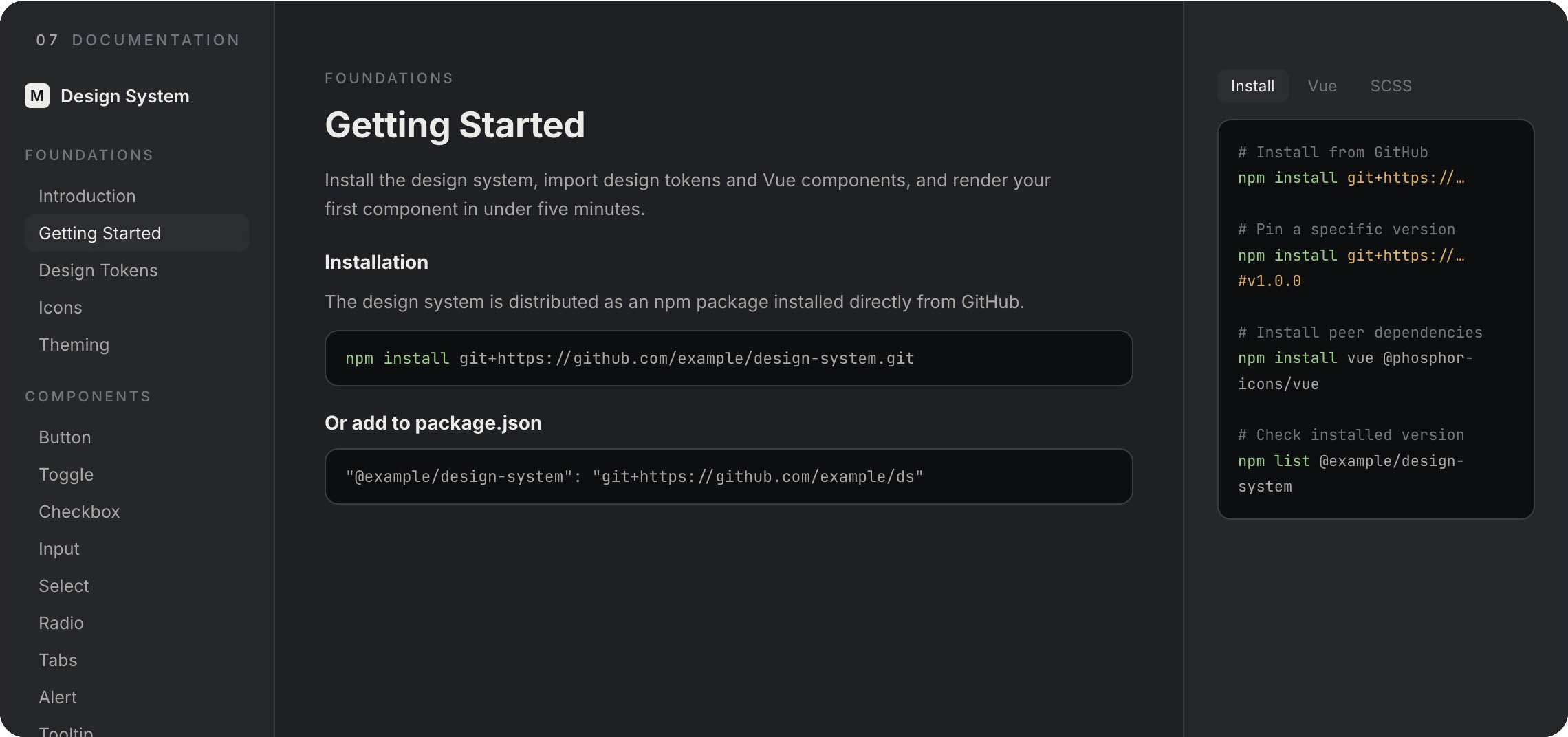
My documentation should be the place where developers consume everything they need for their work — tokens, components, interactions. We do not need to reinvent the wheel. Look at frameworks like Bootstrap, Tailwind, and so on. They show the perfect version of documentation. The kind that developers regularly consume.
Create (and Maintain) Design Systems
So how do we create such documentation? AI saves us from this pain. We can let AI process what we have created in passive form and make an active, interactive version. We have tokens, we have atoms, we have states and modes. That is everything an AI agent needs to connect the dots and spit out an interactive component. In practice, we have a project that contains tokens and we let the AI agent do its work. The output is therefore interactive documentation including initial implementation — code. The developer then takes this documentation and passes it on to their own agent, which starts where I left off.
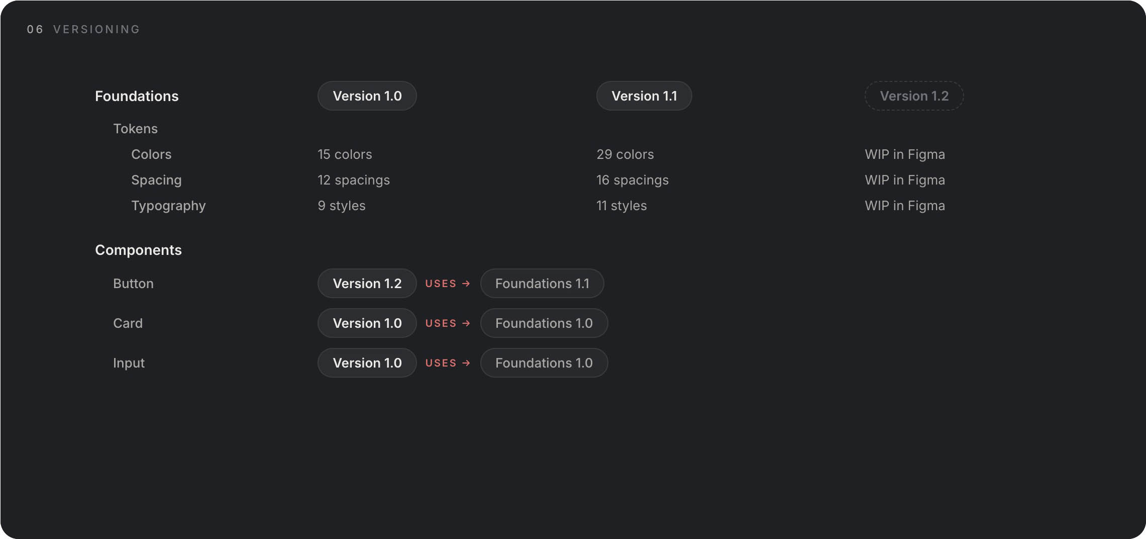
What about maintenance? We version both tokens — we call them foundations — and components. It is up to us where the truth lies. Our source of truth will be the documentation. The developer knows that the component lives in version 1.0 and can work with it. Meanwhile, in design, we are working on version 1.1. When it is finished, we move it to the documentation, and a new version appears there. So we do not stay only with this ideal case. We also version tokens, and in this way we maintain awareness of changes. Developers know that version 1.0 is in production but version 1.1 is already available. Something has changed. It may happen that at one point a developer is developing a feature where there are new component versions, or a component in version 1.0 uses tokens version 1.0 but that same component in version 1.1 uses components 1.1. It is necessary to switch to new versions of both the component and the tokens. This system has its pitfalls, but so does life.
We can go one step further and use AI to create design systems. As a designer, I know exactly what a design system entails and I can define it. AI does not yet do such a good job (April 2026). But it can save you an extreme amount of manual work. It will not make decisions for you. But you can take this article and use it as a prompt for your design system. I think a certain amount of manual work or designer attention will always be needed. I have already created a few such design systems and I think it would be appropriate to create a “hand crafted” certification, because that is what is still missing. But no, I am joking — sort of. AI will help you create a great design system, but it will not replace the decision-making process. And if it does, will it be good?
Interactions
Our interactive documentation has helped us define the most fun part of a design system, the part you cannot do in Figma or passive design. And that is interactions. It seems automatic, but every person has a different understanding, a different interpretation. Developers have no problem understanding dimensions and math, but if I got a crown for every phrase “but it was supposed to work differently,” I would have at least enough for a beer. If you give developers a piece of your vision, it saves effort, time, and some hair pigment.
Detachment
Maybe just one small thing. What do I do when I need to modify or adjust a component slightly because I need different functionality in it? It only partially fits. This is more of a philosophical level. I ask myself: does this component still serve the same purpose when I want to change it? And if so, should I change it? Answer that yourself. I have two paths. The first is to create multiple components, but I must be careful to still be consistent and create patterns. The second path is at the cost of not having a perfect UI, but being subordinate to the pattern. In other words, the block will not be exactly as I would like, but the component will serve its purpose.
Duplicating a Design System
Okay, we have a finished design system. Let’s go. But what if I want to create a new design system for another project? Do I have to start from scratch again? I have good news and bad news for you. The good news is that a good system is based on the same structures — I can just change the data. So I can make a copy and change the tokens, rearrange the components. Every project is different. It serves a different purpose, it should evoke different feelings.
That is somewhat connected to the bad news. Our goal is not to create generic systems, our goal is to create design that evokes emotions, arouses feelings, and serves a purpose. That purpose can often be so different that creating a design system involves a different process and you cannot just copy and adjust. The output, however, is the same. Functional, consistent communication based on patterns.
The Future of Design Systems
Design systems have always been here and always will be — they are the foundation of any functional communication. I just think their creation and interpretation will change. I think that in a few months or years, we designers will be creating development-first design systems. Figma and similar tools will become just tools, not the place where we exist.